Sunday 14 February 2010

GTS MotoCross Helmet & Goggles for Sale


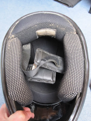
I am selling my GTS MotoCross Helmet plus I will also include a pair of Oakley goggles.

The helmet is in good condition - the paint has a few scratches as you would expect from a second hand motocross helmet HOWEVER the visor (which is a screw on extra - not part of the actual body of the helmet) does have a crack about 2 inches long - not from a crash but from it getting stuck under one of the bikes in the back of my mates van.

The size is 54 X Small - to would probably suit a man with a small head (fits me fine) or a teenager.

Take a look at the pictures - any questions just let me know.

Sunday 7 February 2010

Lotus Wheel Centre Caps


I have three Lotus Centre caps for sale.

They are all in very good condition (however one only has 2 grip/arms on the back instead of 4 so I will sell this one cheeper - see photos).

You can either collect them from me or I can post them (I can find out how much this is but it shouldn't be much).

£6 each (the one with just 2 grips is £4) or £15 for all three.

Lotus Elise S1 Front Wheels For Sale plus Pirelli PZero Tyres


Lotus Elise S1 Front Wheels For Sale plus Pirelli PZero Tyres

Both wheels are inexcellent condition - a couple of small scuffs but NO curbing.

The Pirelli PZero tyres are still legal but they haven't got much life left so you might want to swap your existing tyres on to the wheels soon or get some new tyres.

Price
£100 each or £180 for both

You can either collect them or I would be willing to meet you half way (depending where half way is...) or you can arrange a courier.

Monday 29 September 2008

Whistlejacket and Scrub – New Exhibition at Leeds Art Gallery


Whistlejacket and Scrub: Large as Life the great horse paintings of Stubs is a new exhibition at Leeds Art Gallery (showing until 9th November) that focuses on two of George Stubs largest and most famous horse paintings ‘Whistlejacket’ (which has been loaned to the gallery by The National Gallery) and ‘Scrub’ (to my surprise the paintings really where, was the name of the exhibition suggested, as large as life). George Stubs was an 18th century painter who is most famous for his horse paintings, these particular two where commissioned by the Marques of Rockingham (although for an unknown reason he rejected the painting of scrub). In addition to the two main paintings there are several smaller paintings by Stubs and post interestingly for my several of his horse anatomy studies showing various bone and muscle structures of a horse. I believe it was this in depth understanding of the anatomy of the horses he was painting which gave Stubs the necessary experience and skills to approach these large paintings which are as much a scientific study of the horse as they are a piece of art.

I also felt that the exhibition had been curate very well, the two main paintings were raised forward on deep red coloured walls which not only made them stand out even more but also added a sense of regency to the exhibition – these where famous race horses after all. (See my sketches)

I visited the exhibition as I am working on a new identity for an equine training school at work at the moment and I felt it might give me an interesting insight, but even if you have no special interest in horses I’m sure you’ll enjoy this (free) exhibition.

The Villa Tugendhat in Brno, Czech Republic


I visited The Villa Tugendhat when I visited the Czech city of Brno a couple of years ago as it is regarded as one of the most important buildings, both historically and architecturally, in the country. The Villa Tugendhat was designed and built in 1930 by German architect Ludwig van der Rohe for the Tugendhat family of Brno and is an early example of ‘functionalism’ in a building and modern architecture. Although the building and design is not to my personal taste it is easy to see why this building is so special and at the time really took peoples breath away. I was built using, what was then a revolutionary new technique (like a modern skyscraper), of a steel frame which meant there was no need for thick supporting walls. As a result of this the front and sides of the building are one solid window with a magnificent view overlooking Brno below it - the upper floors appearing to hover above it (see top picture). Other than the spacious feel of the building the other thing that struck me was the lack of any paintings or decorations on the wall – instead the house has been designed so that key feature walls and areas are made from special materials such as onyx (a polished stone which looks like marble) and wood from rare tropical trees. As I mentioned, the house is also of key historical importance – it was the venue of the 1992 meeting where Czechoslovakia was split into two separate nations – the Czech Republic and Slovakia. Two iconic pieces of furniture where also designed by Ludwig van der Rohe for the house – the Tugendhat chair and the Brno chair.

I did feel it was a shame though that the house, which was specifically designed to be a functional family home, was only lived in for eight years as the Tugendhats, who where Jewish, fled Brno in 1938 after Germany signed the Munich agreement.

The top photo is a scan of a postcard I bought whilst I was there – the other photos come from Wikipedia as you where not aloud to take photos whilst in the house.
Cidade de Deus (The City of God)


I tend not to have the patience to watch a whole film in subtitles, but for Cidade de Deus (which translates from Portuguese, the language of the film, as ‘The City of God’) I will make an exception. Set in the slums of Rio de Janeiro, Brazil, Cidade de Deus is the story of the Rio de Janero housing projects decent from relatively idyllic beginning in the 1960’s to a violent, cruel, poverty and crime ridden slum in the 1980’s and is told/narrated by resident and teenager ‘Rocket’ who unlike most of his friend and neighbours has aspirations of been a photographer, not a gangster (or hoodlum). The film is very fast paced and with editing and camera work that wouldn’t feel out of place in a Quentin Tarentino film. For me the best thing about the film is the intertwined story lines which cut back and fourth, allowing you to see how each of the characters is related to the others and history between each event. I also found it interesting when watching a the ‘making of’ documentary which came free on my DVD to find out that many of the cast where not professional actors but genuine residents of Rio de Janeiro’s slums and it is this which helps add real authenticity to the film.

The Forbidden Corner


Advertised as ‘the strangest place in the world’ The Forbidden Corner in North Yorkshire really is one of those places you have to see and experience for yourself to really understand it. The best way I can describe the experience is that when you enter The Forbidden Corner it is like becoming Alice in Wonderland and going down the rabbit hole. You given a list of ‘things to see’ when you enter the garden full of cryptic clues such as “The snake pulsates, with light it sheds, Dare you pass, between the heads.” And sure enough as you walk around the winedy footpaths, in and out of woods, through mazes and over bridges you will come across an entrance to a cave in the shape of a snakes mouth. If you go through the cave, after seeing more unusual things such as a village of mice that are attacked by a giant cat, you will appear through a window into another part of the garden. One of the things I like about the experience is that there is no set route, you just wander from clue to clue down the various footpaths meaning if you where to visit again the experience would be completely unique again. Although it is really aimed at children it’s the sort of experience anybody of any age can enjoy, it’s a real life fantasy adventure.

Visit the website at http://www.theforbiddencorner.co.uk

Tuesday 23 September 2008

Breakfast at Tiffany’s


Breakfast at tiffany’s was originally a book written by Truman Capote in 1958 but was adapted for film in 1961 with Audrey Hepburn cast as the main character Holly Golightly, probably the most iconic character she every played. The film is basically a romantic comedy about the romance between Hepburns character and her new next door neighbour ‘Fred’ (he was given this nick name by Holly Golighty as he looks like her brother). The storyline of the film didn’t particularly grab me personally, but what did was the setting of the film – 1960’s New York oozed style and fashion whether it was the 60’s furnishings of Holly’s apartment or the chrome finished bus that Holly’s ex-husband left on I really enjoyed this glimpse of what the world looked like in 1960 (at least what it looked like according to Hollywood). I found it interesting to think that items such as furniture and vehicles from this period can still look stylish nearly 50 years on, where as many of the concrete buildings of the same period don’t.

The New York City Waterfalls Exhibition


I came across the New York City Waterfalls exhibitions when I saw a video of one of the huge man made waterfalls on youtube. I initially thought it was a video of a water main running under the Brooklyn Bridge that had bust, but when I looked into it further I found out that it was in fact a man made waterfall. The waterfall (which you can see in the above video clip) is one of four currently ‘flowing’ around New York as part of a public exhibition designed by Danish artist Olafur Eliasson (the man behind the ‘Sun’ exhibition in London’s Tate Modern a couple of years ago). The resulting effect is very impressive and slightly bizarre, it looks like an actual Amazonian waterfall right in the heart of New York – or like some thing from a Hollywood disaster movie.

The waterfalls will ‘flow’ in New York until 13th October 2008 when the exhibition finishes.

www.kneebouncers.com/kneebouncers.html


Kneebouncers is a fun site designed for young children to play on, it’s full of simple games where you press a button on the keyboard and some thing bright and colourful happens on screen. The site is really well designed, the designers have identified that there was a need for a site that very young children can use with their parents, where the games aren’t difficult or need any sort of hand eye coordination. I was first shown the website a couple of years ago but I’ve recently been working on a project at work where we wanted to build some simple games into it so I got in contact with the designers who built this site to fin out how they did it – here is the response I got from Jim Robinson of PUNCH

“Hi Danny, Thanks for the email! Yes kneebouncers is all flash -- Kurt Dommermuth (flash guru you may want to visit more stuff he has done -- kurtdommermuth.com or thetruthiswhatyoubelieve.com or the flash community organicflash.com) is my best friend and once I came up with the idea and drawings he brought it all to life.”

Stop Stealing Sheep and learn how type works by Erik Spiekerman and E.M Ginger


Erik Spiekerman is a highly prominent designer and the creator of the typeface ‘Meta’ and his book ‘Stop Stealing Sheep and Learn how type works’ is part of the suggested reading list for my BA Graphic and Communication Design course at the University of Leeds. This book provides a crucial incite into type and how it can be used that I would recommend to any other design student. The book starts with a very interesting anecdote which shows just how important type is to us – it talks about how western travellers often feel so lost and out of place when travelling to China or Japan because due to the different writing system, instead of being able to recognise or understand even a few phrases or words they can read nothing – not even price tags. The key thing that I took from the book was that as a designer I have to think very carefully about which face I choose for each project as to choose the face that will work the best. For example bold, highly legible face are need for road signs but thin ones used where space is a premium – type can fulfil complex demands. Different faces can also portray different emotions and have different personalities (Gill Sans wouldn’t work on a sympathy card just as Sabon wouldn’t on a 5 year olds Birthday invitation).

Inside Out by M. Cameron – World Pinhole Day Exhibition


The top picture that you see here is a (rather poor scan of a) photo taken using a simple pinhole camera that I found in amongst my college portfolio. The picture was taken as part of ‘world pin hole camera day’ by M. Cameron in Empire Vale, Australia and was the result of a ‘happy mistake’ when Cameron accidentally double exposed the film, once inside his apartment and one out side. He only noticed his mistake when he developed the film, however it came out really well.

Word Pinhole Photography Day is a global annual event (the last Sunday in April) when enthusiasts from all over the world “take some time off from the increasingly technological world we live in and to participate in the simple act of making a pinhole photograph”. The aim of the annual event is to “to share their visions and help spread the unusual beauty of this historical photographic process” and as you can see from the other examples of photos taken using pin hole cameras people can achieve some fantastic results only using very basic technology – the website is well worth checking out as it has plenty more brilliant examples of pin hole photography (see www.pinholeday.org) The next world pinhole day is Sunday 26th April 2008 – check out the website a bit closer to the time to find out if there are any exhibitions near you (or to find out how you can enter your pinhole photos).

The Freitag Store in Zurich


The Freitag store in Zurich is a brilliant example of a really unusual piece of architecture, a clever use of recycling but most importantly in my opinion a fantastic advert for the company and way of broad casting what it does and its brand values to the world (Freitag is a fashion company that makes bags, wallets, I-pod cases and similar goods out of recycled truck tarpaulins). The store was built on a relatively small plot of land out of 17 disused dry steel containers – the type used for storage and shipping on lorries (which ties in with the truck tarpaulins that they make their good out of) – with the base (the bottom four stories) working as a shop and the rest of the tower as a huge advert for the company and brand. Being built on a brown field site and out of old dry steel containers which have little value after their working life is over the cost both in monetary terms and to the environment will have been a fraction of that if the company had wanted to build a traditional shop in heart of Zurich.

Friday 19 September 2008

1000 Pin-Up Girls – Taschen


I bought the book ‘1000 Pin-Up Girls’ in Waterstones last week, which gives a fascinating insight into men’s magazine of 1950’s America. The book, after a short introduction, is simply a collection of pictures, articles, photo shoots and adverts from several of publisher/editor Robert Harrison’s magazines of the period, which appear to be the equivalent of FHM and Maxim today. The photos (many of which aren’t even photos but illustrations instead) are very tongue in cheek and very tame compared to today standards, but it is quite easy to see how 60 years ago they could be considered shocking to some people. It is also interesting to see how tastes have changed over the years – the large hips and stockings wouldn’t really fit in today’s magazines where photoshoping images is the norm. The thing that really attracted me to the book are the wonderful pin-up girl illustrations, I love the playfulness, the long legs and exaggerated curves which all look much more fun than sultry cover girls of today.

Sunday 14 September 2008

www.spimsonizeme.com - Simsonize Me!


I guess a lot of people will have already stumbled upon or been shown this website already but if you haven’t and you’ve got 10 minutes to spare it’s well worth a visit. www.spimsonizeme.com is a neat little micro site / marketing ploy set up as a joint venture between Burger King and the creators of the Simpson’s movie when they where launching it. Basically it allows anybody to up-load a photo of themselves which the site then ‘Simpsonizes’ you – creating a picture of what you would look like if you where a Simpson’s character. Once it has done this you can fine-tune your picture before adding a background and downloading it (or sending it to be printed on a mug, if you really want).

You can have some great fun with the site, last Christmas I got a photo of everybody in our office and spent an evening Simpsonizing them all for a big group portrait that I gave to the team for Christmas. The pictures that the site gives you aren’t good enough quality to print from so I had to re-draw each person in Adobe Illustrator (which was a bit of a pain) but the effect was well worth it as it made a pretty unique and amusing gift.

So, if the credit crunch has hit you hard and you’ve got a friend who likes the Simpson’s feel free to steal this idea at Christmas (and if you don’t have the design software to redraw your characters for printing you can get a whole evenings worth of work out of me for a box of Jaffa Cakes…).

How to loose a few hours - http://www.ffffound.com/


I was introduced to fffound.com by James Callahan (http://jamesandjoecreative.blogspot.com/) which is a website that works as an online collection of found images, illustrations, photos, logos, adverts and art from various other websites and blogs. By simply clicking on a picture the site then suggests several other photos that you might like or from the same user – the first time I visited the site I must have spent best part of an hour clicking around like a kid in an online sweet shop. Next time I’m struggling to find some inspiration I know which site to visit.

I’ve picked out a few found images, which I liked – as you can see from the Ikea coffin instructions some a pretty random. The polar bear made from the lines of a tube map I really clever as well.

GF Smith Mail Shot


These are some photos of mail shot sent out by the paper company GF Smith that I was shown by Mick Pearson, a Senior Partner at the design and advertising agency Forman Design. I think this still stands as one of the most interesting mail shots I have seen. The pack was designed to promote the huge range of papers that GF Smith produce. In side the green box (image 1) which you receive through the post is a cardboard box printed to look like a wooden box, the type you keep old photos or memories in, with the word ‘Strathmore’ in silver on the top (image2). Inside the box you do indeed find what look like someone’s memories (images 3 and 4) – there is everything from old photos, new photos, cigarette cards, invitations, postcards, menus, business cards, letters and certificates. It is impossible not to sit and flick though the contents of the box and look at each item. The idea of the pack is that each item is printed on a different paper or card from GF Smith’s range (it tells you which one in small on the back of each item) and it allows you as a designer to see how each paper can be used and to get a real feel for the possible applications of each paper. This shows how the papers will work in the real world much better than the usual paper sample book s that are sent out but it also acts as a constant reminder of the company – Mick didn’t want to throw his out.

The cost however of producing and posting a mail shot like this out will have been very high, so it will only work on fairly short print runs and for sending out to very specific clients.

Café Direct Shoulder Bag


This is piece of work designed by Andrew Cheung to promote ‘5065’, a range of fair trade coffee’s form Café Direct specifically aimed at students. The idea it’s self of a shoulder bag that looks like it is made out of a coffee sack is itself a nice idea, but it’s the ‘wake up’ typography / logo that really caught my eye, I love the way the word ‘up’ looks like a steaming cup of coffee.

Antiques Roadshow Logo


We all have our guilty pleasures in life – mine for some bizarre reason is watching the Antiques Roadshow. Before you ask, no I’m not exactly the Roadshow’s key target audience, I’ve no grey hair, the nearest I’ve been to a real auction is eBay and the closest thing to an antique in my house is my VCR – the thing that appeals to me is the whole ‘one mans meat is another mans poison’ aspect of the show. I love the way that people bring on items that I, and often they, consider to be worthless tat that they’ve found in the attic but that someone out there is willing to pay thousands of pounds for it.

Anyway, the reason I’ve mentioned the Roadshow in this blog is its logo. Shown here in black it looks average, but on TV with a gold metallic effect it really comes to life – it looks a gold antique broach that you would find on the show. I love the fluid feel and the way that the ‘A’ flows into the ‘R’.

Felling good is a walk in the park


It’s a couple of years old is this piece by Ziggi Baker which aims to get busy, stressed out city folk to use their public parks more often. I like the contrast between the stress and frustration on one side and how the park can help relive this on the other.

Tic Tac Adverts


These are a series of press adverts for the mints ‘Tic Tacs’ designed to emphasise there minty freshness by two advertising students Laurence Collings and Tom Green from the University College Falmouth. It is the simplicity of these ads that I really admire. Being a student myself I understand that budgets can sometimes be a factor when we are creating designs however instead of being constrained by it they have been liberated and created something really unique. Had this project been given to a large and busy design agency with a bug budget there may have been a temptation to create a rather generic mint advert involving ice crystals, fresh water and people kissing. Instead of this the pair have gone back to basics and created some simple adverts (a Tic Tac on a tooth brush, a Tic Tac as a speech bubble) that project the Tic Tac brand and message brilliantly. Students the world over (myself included) should take note.